Thursday
Jan222009
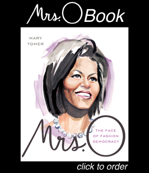
One New Look Deserves Another
As Mrs. O moves into the White House this week, we thought we'd mark the occasion with a brand new logo. We hope you like it.
in  Outfits
Outfits
Reader Comments (54)
Love it!
It's lovely!
very chic ;)
The last baby born to a sitting US President was 116 years ago (President Grover Cleveland). Wouldn't it be a blast if the Obamas had a baby in the White House?
I like it. It is kind of Jazz ageish. Is there any previews of Feith's Target line?
I like it!
It is supreme ! Tres chic.
Not sure my first post took, so apologies if this comes up twice.
I'm really happy that Mrs O is speaking out about the Sasha and Malia dolls. Breaking news from Crain's Chicago: http://www.chicagobusiness.com/cgi-bin/news.pl?id=32717&seenIt=1
Beautiful and stylish, says I. Also hooray hooray for serifs--in a Helvetica ruled world the typeface choice is positively refreshing.
Love you madly,
Mrs. A
am i the only one who can't see the new logo? or is it my comp?
Hi Layo G., You might need to go to Tools -> Internet Options -> Delete Files -> Ok. That's what I had to do. By the way, I should add we're still optimizing a few things...
I know I a odd one out on this. But I loved how the wide "O" resembled the one of her husbands sans red, white and blue. The "O" is almost lost. Maybe a couple of spaces after the period so that "O" stands out.
You could also just hit F5, or click refresh while holding down the shift key. :-)
Also, please don't abandon us on twitter! I wondered why no updates for so long and wandered over here by chance, but generally I rely on twitter to let me know when there's a new Mrs. O entry.
Hi Mary, I have the same comment about needing a bit more space between the Mrs. and the O. It was hard to tell until we saw it on the page though. Look for that change in the next day or so...
And Deirdre, thanks for the heads up on Twitter. Not sure why the updates aren't working? Will look into it!
Love it! (But then again I loved the old logo too!)
Wonderful!!!
Entertainment Tonight is running this segment which basically follows Michelle for her first 100 days. They celebrated her inauguration day outfits - including the gown. I think that gown is just beautiful and dreamy. They even did a part where you can get something like her dress affordably.
Anyway, Michelle is really being thrust in the spotlight by virtue of her being so darn fierce.
I don't like it, but it's your site and I don't visit here for the logo.
Love it! Chaud !
I like the old logo better. It was more distinctive.
Supremely stylish. By the way MAC users who can not see it simply go to your browser and choose "Empty cache."
I like the old one better. This new logo is a little harder to read. I think making the O larger and spacing it out, as others had suggested, would be better.
And how about some COLOR. How about making the background of just the top heading (where the logo is) a cool color like periwinkle or a royal purple? That would be great.
por favor, site en español!!!!
Please, site in spanish too!!!
Thank you so much,
Sandy
I love Obama
I love Whitley Kros (whitleykros.com)
I love Cat Power (album jukebox)
I love Bob Dylan (everything)
I love India (the children)
I love America (the hope)
share what you love.
I think Michelle said something on the campaign trail about "the campaign is turning out to be the third baby". Also, she turned 45 about 5 days ago. That's getting into risky territory, and I can say it because my one-and-only was 6 mo on MY 45th b'day.
The first logo was far more readable -- if not as "chic" -- and put the emphasis where it belongs: on O-power. As someone said, I don't stop by for the logo. Nice blog.
arrgh! i still can't see it, i only see the old one.... :-(
o well, i'll probably have to go onto another computer to see it
ps; HOW EXCITED ARE WE THAT MRS O. MIGHT BE ON THE APRIL VOGUE COVER?!?!?! (a slip of the mouth by her hair dresser apparently outed the news)
Aw, bummer. I LOVED the old one, due to the emphasis on the O (pointing not only toward her husband but to another of our classy American fashion mavens of history), and because the typeface was fabulous. Very reminiscent of the letters that spell out the title of Vogue (which is a good cultural reference!).
I prefer the old logo too. This one is nice, but that one was better.
looks great
I see it now!! yay!!
as to the logo, i like both of them! this is a hard one for me...I think im leaning to the old logo, but this one is nice too....urgh, this is the problem with choices....lol
I love your site - but do not love this new logo. The old one was by far better!
Don't like it. The lack of space between the s.O makes it read as MRSO to me, which is reminiscent of MRSA.
Since you asked, I liked the old better but doesn't matter to me either way. Great site, thanks
Sorry, Mrs. O, I have to cast my ballot for the old one. This new one is harder to read. It's cute, but it makes me think of miso...as in miso soup...which is yummy and I'm hungry.
Elegant and fresh, just like Mrs. O.
Thanks for the great site - I'm addicted!
Think I preferred the old logo...
I just found this blog and love it!
very queen
I'm HOOKED on this blog. PLEASE more posts. I put an icon for you up on my desktop, and I can't stop clicking it!!! The whole subject is fascinating. Email me if you need more writers.
I enjoyed the pictures and look forward to more.I thought the first lady looked stunning.
Very fitting, ladies!
Eh... The font is maybe more appropriately sophisticated and feminine, but it's too squished and doesn't read that well. I think just spacing it out a hair would help a lot.
The other typographic changes to the site (sidebar, submit button, etc.) are fine.
Kristan
http://jbu.phuzzymath.net/
I love this clip about how Simon Doonan (who is really funny in person), the window director at Barneys instantly changed their NYC window display to pay tribute to Mrs. Obama and Isabel Toledo....LOVE IT!!
ps: I walked by there the other day, and it looks really nice in person!!
http://www.huffingtonpost.com/susan-sawyers/michelle-o-fashion-provoc_b_160187.html
I am hooked on this site as well! More posts please!
And the logo...I liked the old much better. Sorry. It was so stylish to me. This one doesn't stand out as much, and the girly typography is maybe a tad cliche. I think the old logo fits our subject (Michelle Obama) much better.
Anyways, still adore this blog! I followed Michelle's fashion for almost the whole two years of the campaign. I wish this blog had existed back then!
I think the old logo was easier to read. I know you said, "Hope you like it." Not, "What do you think?"
Love the blog, though. Can't believe I've become so star struck. It's not like me.
Thanks, lisa
I love this site. But, I acutally do not like it. In comparing the old and new - the fuller Mrs. O logo seems better. It just seems it conforms to the usual idea of slim and chic. We love Mrs. Obama because she is every woman and not the usual and the world is captivated by it.
The well rounded Mrs. Obama is not changing so the Mrs. O logo should not either. Love this site.
Still love this site. Also, maybe an idea would be that you could change the look weekly or monthly. That would be Mrs. O.
love the site. but don't like the new logo, sorry. i liked the retro kind of courier font of mrs-o. please change it back.
other than needing a bit more space, it's just fine. just keep the posts coming...
More kerning, please! The letters are too close.